In 2010 Tom Hooper won the top Oscars and garnered innumerable accolades for himself and all others involved in his quiet drama about the fears of a speech impaired King George VI.
The King's Speech was wisely released in a manner to attract critical attention and the marketing team undoubtedly dived headlong into the game of "Oscar baiting."
Movies void of explosions, sex, horror, murder, slapstick, Scarlett Johansson, or anything remotely titillating are faced with difficult marketing problems. Critical acclaim - especially in the form of a prestigious Oscar - can be the saving grace needed to bring in the audience ( read - the money) needed to make the film successful for the backers.
For this reason a large portion of a films budget goes not into the making of the film itself, but in getting an audience interested in seeing it. Nothing new here. Oscar winning films often use similar marketing strategies - for example they debut toward the end of the year so as to be fresh on the minds of Academy voters.
Nothing is more central to an Oscar campaign than the face of a movie - its poster.
As with any visual design the goal is Look at me! Remember me! As with most forms of advertisement, movie posters are grouped to together - so the competition for eye time is fierce.
A successful movie poster needs to be visually intriguing, or at least "cool." It needs to fit the style, tone and often message of the film. If there are people involved with film that audiences like the movie poster can successfully advertise them. It should immediately suggest its target audience - for example a poster for Hostel or Saw will differ obviously from Finding Nemo or Shrek.
These below are studio posters - put out by the marketing team of the film. At worst their generic formula will rely heavily (sometimes solely) on star power, fail on giving genre details, remind the viewer they are photoshopped and leave the viewer confused rather than curious.
What follows ranges from bizarre to bland and boring:


.jpg)


But, on occasion they go beyond and present something that does more than provide the simple details. Whether through mystery, nostalgia, or simple beauty these posters will standout from the others and arouse curiosity. The best ones evoke theme and employ foreshadowing.


 '
'


Back to The King's Speech. Oscar contenders need to look smart, carry dramatic weight, and attract with sophistication. They are not necessarily art-house films, but they are not summer blockbusters either.
First the mediocre:


The King's Speech was wisely released in a manner to attract critical attention and the marketing team undoubtedly dived headlong into the game of "Oscar baiting."
Movies void of explosions, sex, horror, murder, slapstick, Scarlett Johansson, or anything remotely titillating are faced with difficult marketing problems. Critical acclaim - especially in the form of a prestigious Oscar - can be the saving grace needed to bring in the audience ( read - the money) needed to make the film successful for the backers.
For this reason a large portion of a films budget goes not into the making of the film itself, but in getting an audience interested in seeing it. Nothing new here. Oscar winning films often use similar marketing strategies - for example they debut toward the end of the year so as to be fresh on the minds of Academy voters.
Nothing is more central to an Oscar campaign than the face of a movie - its poster.
As with any visual design the goal is Look at me! Remember me! As with most forms of advertisement, movie posters are grouped to together - so the competition for eye time is fierce.
A successful movie poster needs to be visually intriguing, or at least "cool." It needs to fit the style, tone and often message of the film. If there are people involved with film that audiences like the movie poster can successfully advertise them. It should immediately suggest its target audience - for example a poster for Hostel or Saw will differ obviously from Finding Nemo or Shrek.
These below are studio posters - put out by the marketing team of the film. At worst their generic formula will rely heavily (sometimes solely) on star power, fail on giving genre details, remind the viewer they are photoshopped and leave the viewer confused rather than curious.
What follows ranges from bizarre to bland and boring:


But, on occasion they go beyond and present something that does more than provide the simple details. Whether through mystery, nostalgia, or simple beauty these posters will standout from the others and arouse curiosity. The best ones evoke theme and employ foreshadowing.


 '
'
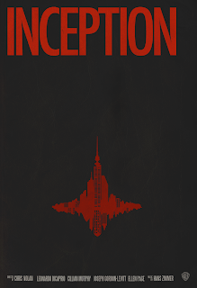
Then there are fan made posters. Here the fad is minimalist and fan posters often have more nuance as they are created by . . . fans who have seen the movie many times and love it. These films already have their audience and their designers only have their customers to answer to and so are likely to try a more daring approach.


First the mediocre:


There is nothing particularly striking about these posters. The first and third will attract attention, but only for a moment. The second looks like every poster of family drama ever made and has little at all to do with the actual movie. They all suffer from odd facial expressions that are puzzling to the viewer - serene? whimsical? Worst of all they are each rather forgettable.
And then there is worst example. When Hooper saw this poster he was horrified and called it an absolute "train smash."
Worst:

This tics each of the requirements on the bad list: horribly photoshopped, no clear ideas or themes, baffling expressions - are Carter and Rush playing some sort of prank on Firth? There are no marks of sophistication, no dramatic weight. It looks like a low-budget Hallmark movie. And the awful tagline: "When God couldn't save the King, The Queen turned to someone who could."
And the best:

The color pulls the viewer in immediately - it is not an average color for a film poster. The images are very simply, yet richly detailed. It is not crowded - just one simple line of praise. Indeed, it plays off current trends of minimalism. It is vague, but in a way that is thought-provoking rather than bewildering.
This poster is much better suited to the subtle drama that took home the Best Picture prize of 2010.
No comments:
Post a Comment